Prof. Douglas Thain at Notre Dame
Blog: Visualizing Clusters in Real Time
09 Dec 2008 - Douglas Thain
The end of the semester is nearing, so activity in our distributed system really shoots up as undergraduates finish their semester projects and graduate students hurry to generate those last few research results. You can see this activity reflected in a number of visual displays that we have created to track activity in the system.
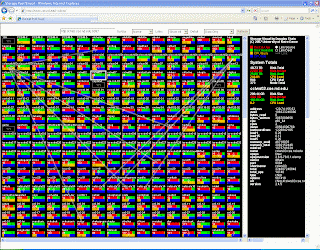
For example, the following is a snapshot of an applet that displays the current state of all machines in our
Chirp
storage cluster. Each machine is represented by a box, where colors indicate resources on each machine (memory, disk, cpu), and arrows indicate active network transfers. You can click on the following snapshot, or view the current
live display
if you like.

With a quick view, you can see four different things going on. Two students are working on their semester project in distributed systems, which is to create a dynamic cloud of web servers. This is reflected in the spread of network transfers going from two submit machines near the top, transmitting web server data to the hosts where they happen to run. One student is running a large All-Pairs job: this is reflected in the small vertical arrows about one third of the way down, indicating heavy disk traffic local to each machine. Closer to the bottom, someone is keeping the CPUs busy on the cluster named sc0-xx: this cluster runs
Hadoop
, so it is probably a Map-Reduce job.
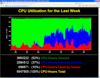
Of course, this kind of display is only good for the high level immediate picture. It only tells you what is going on in the last minute. For a more historical view, we track and publish data from our
Condor
distributed batch system. For example, this shows the CPU utilization of our system over the last week. The red part shows the number of CPUs in use by the person at the keyboard, the green part shows the number of CPUs idle, and the blue part shows the idle CPUs harnessed by Condor. As you can tell, things picked up in the middle of the week:

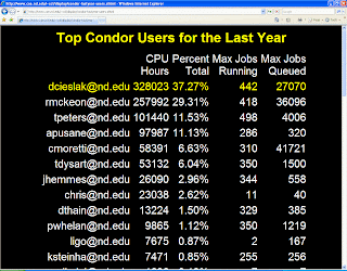
This display shows the total CPU time consumed by different users over the last year. A few students have really racked up a lot of computation!

All of these displays rotate automatically on our "scoreboard", which is a monitor in a public hallway of the Engineering building at Notre Dame. It's not unusual for me to step out of my office only to find a few students checking to see who scored the highest over the last week! We ought to give a yearly award for the students who makes the best use of the system.
On a more philosophical note, the displays really help to make our work more concrete to outsiders. Because we work with intangible software instead of test tubes or fissile material, we don't have a "lab" to show visitors or prospective students. A live picture draws people in: random people from other departments stop in the hallway to look at the scoreboard and ask what is going on. A little effort put into "advertising" goes a long way.
« Prev: Visualizing a Large Distributed System with Enavis
Next: Abstractions, Grids, and Clouds at IEEE e-Science 2008 »