Prof. Douglas Thain at Notre Dame
Blog: Visualizing 10,000 Cores
14 Feb 2014 - Douglas Thain
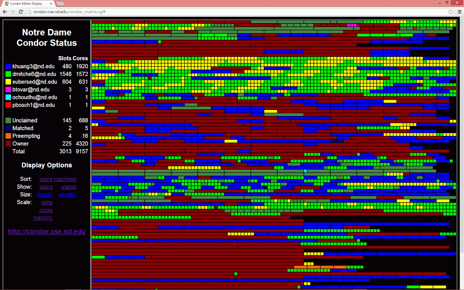
Our Condor pool at the University of Notre Dame has been slowly growing, in no small part due to our collaboration with the Center for Research Computing, where it is now scavenging unused cycles from HPC clusters at the CRC. When the dedicated batch system leaves a node unused, Condor is started on that node and keeps going until the dedicated system wants the node back. Depending on the time of year, that leaves anywhere between 4K and 10K nodes available in the Condor pool.We have tried a number of approaches at visualizing this complex system over the years. Our latest tool, the Condor Matrix Display started as a summer project by Nick Jaeger, a student from the University of Wisconsin at Eau Claire. The display shows a colored bar for each slot in the pool, where the width is proportional to the number of cores.
With a quick glance, you can see how many users are busy and whether they are running "thin" (1 core) or "fat" (many core) jobs. Sorting by the machine name gives you sense of how each sub-cluster in the pool is used:
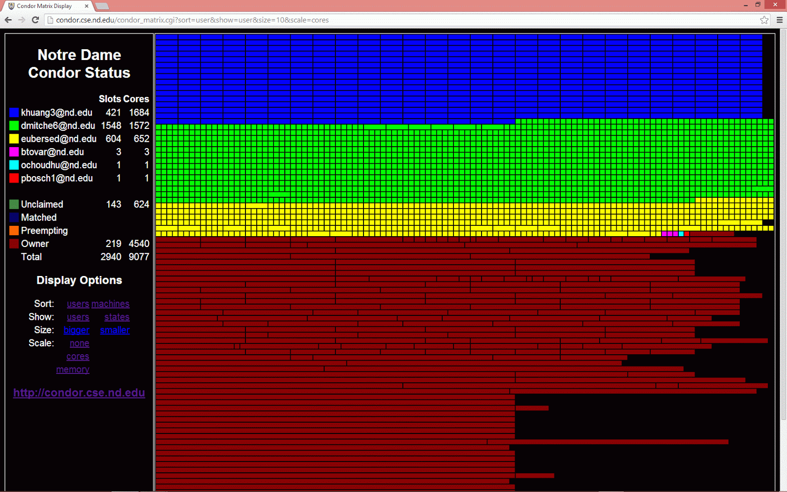
While sorting by users gives you a sense of what users are dominating the pool:
The display is always a nice way of viewing the relatively new feature of "dynamic slot" in Condor. A large multi-core machine is now represented as a single slot with multiple resources. For example, this bit of the display shows a cluster of 8-core machines where some of the machines are unclaimed (green), some are running 4-core jobs (blue), and some are running 1-core jobs (green):
« Prev: Some Open Computer Science Problems in Workflow Systems
Next: Toward a Common Model of Highly Concurrent Programming »

